
개발 기간
2016-07
특징 및 기능
그리드 시스템에 따른 반응형 웹
데스크탑 대응은 10컬럼, 모바일 대응은 2컬럼 그리드 시스템을 사용하였습니다.
코드 설명
grid-responsive.css
모바일 대응 : .unit-s-1-2 ~ .unit-s-11-12
데스크탑 대응 : .unit-l-1-2 ~ .unit-l-11-12
먼저 위같이 class name을 먼저 지정해주고 width를 %단위로 정해줍니다.
그 후 html에서 3등분의 경우 class="unit-s-1-3"로 지정해주면 자동으로 3등분한 style이 적용됩니다.
style.css
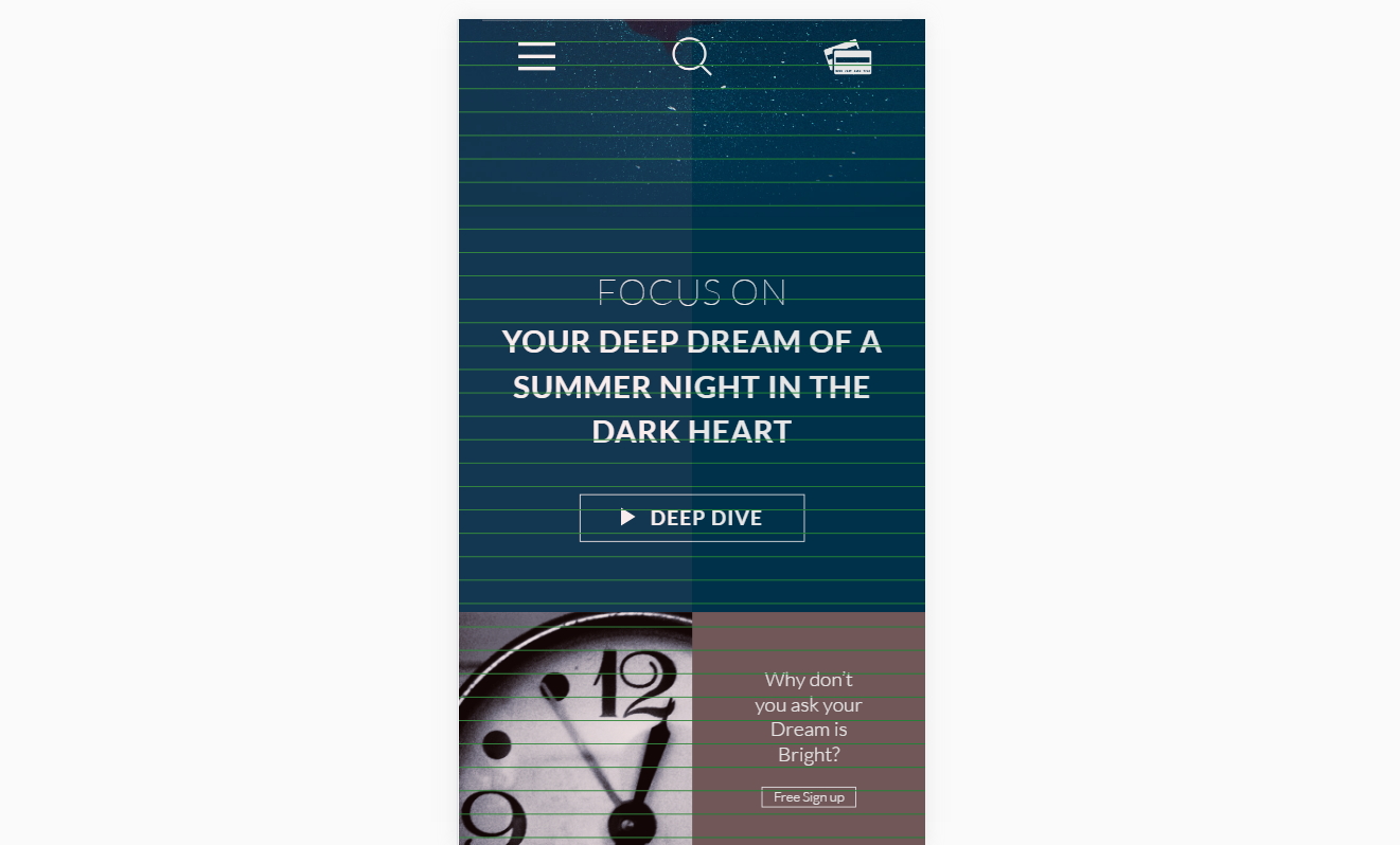
모바일 대응 그리드를 보여주는 부분
linear-gradient로 그리드를 직접 볼 수 있도록 그려주었습니다.linear-gradient(90deg, rgba(191, 64, 64, 0.1) 50%, rgba(0,0,0,0.1) 50%)
: x축 그리기. 50%, 50% 간격으로 그리드 색을 지정해줍니다.linear-gradient(transparent 95%, #26923f 95%);
: y축 그리기. 95%는 투명색, 5%는 색상을 지정해주어 선을 표시합니다.
데스크탑 대응 그리드를 보여주는 부분
linear-gradient 그라이언트 그리드 배경 색상 부분은 모바일 대응과 같아 생략가능하므로 배경 사이즈만 지정하였습니다.
Image Responsive-Scale의 예 (이미지 반응형 크기 대응하기)
|
|
padding-bottom: 세로/가로 * 100%;로 해주면 이미지가 반응형으로 대응합니다.